Uncharted territory: Navigating a sea of data
We love charts at ONS. Can’t get enough of them. They bring to life some of the more complex statistics we produce and help tell a story.
But sometimes they are lost among the sheer volume of content that we publish on our sister website ons.gov.uk.
Here at Visual, we’re all about using different formats to present content, so we’ve decided to regularly highlight one chart which may have slipped your attention, and explain what it tells us and why we think you should take a look at it.
Unemployment
This chart, from the September 2016 Economic Review, gives an indication of the changes in supply and demand for jobs in the past 14 years by looking at the unemployment to job vacancy ratio.
The latest data shows that the unemployment to vacancy ratio was at its lowest level of 2.2 for quarter 2 of 2016 – below the 2002-2007 average of 2.5 for the third successive quarter.
In the same quarter in 2008, it was 2.3.The ratio more than doubled to reach 5.7 at the start of the economic downturn and remained higher during 2009 and 2010. It then began to steadily fall from the start of 2012.
This coincided with the start of the fall in the unemployment rate, when the labour market began to show signs of improvement for those both in work and looking for work.
Unemployment-to-vacancy ratio and its 2002 – 2007 average, seasonally adjusted ratio, quarter 2 to quarter 2, 2016, UK

‘Zero hours’ contracts
The latest ONS figures for workers on so-called ‘zero-hours’ contracts show a rise of 21% for the same period last year.
Around 903,000 more people had a job which did not guarantee a minimum number of hours, compared with 747,000 in the period April to June, 2015.
The release of the data came on the same day as sportswear chain, Sports Direct released an independent review of working practices, a day ahead of its annual general meeting (AGM), and following criticism of treatment of its staff, including the use of zero hours contracts.
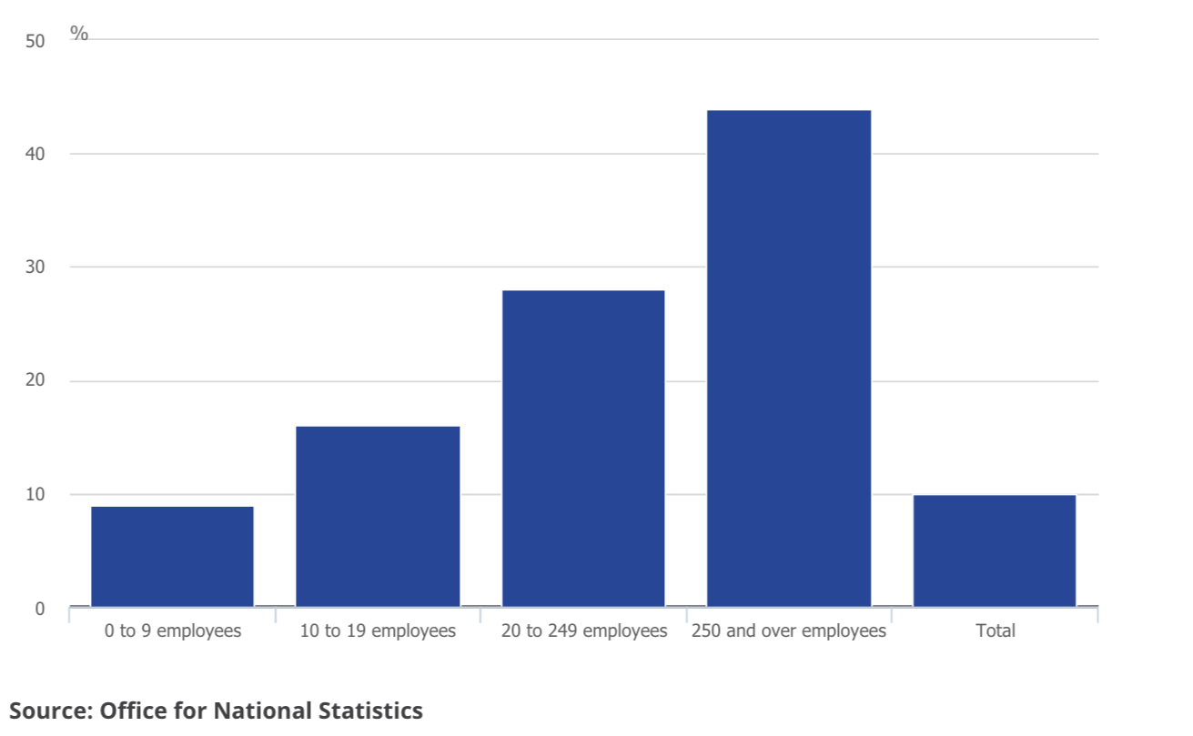
This chart, assembled using the latest available data from a November 2015 business survey, shows the percentage of businesses that make use of zero hours contracts, by the size of the business.
It shows that 40% of businesses that employ 250 or more people make some use of these type of contracts.
Percentage of businesses making some use of contracts that do not contain a minimum number of hours, by size of business, November 2015, UK

Download the data
Greenhouse gases
Climate change has been in the news over the past few days, after China and the USA announced (on September 3, 2016) they would ratify the Paris climate change agreement.
The move commits two of the world’s largest emitters of greenhouse gas to working towards the reduction of greenhouse gas emissions.
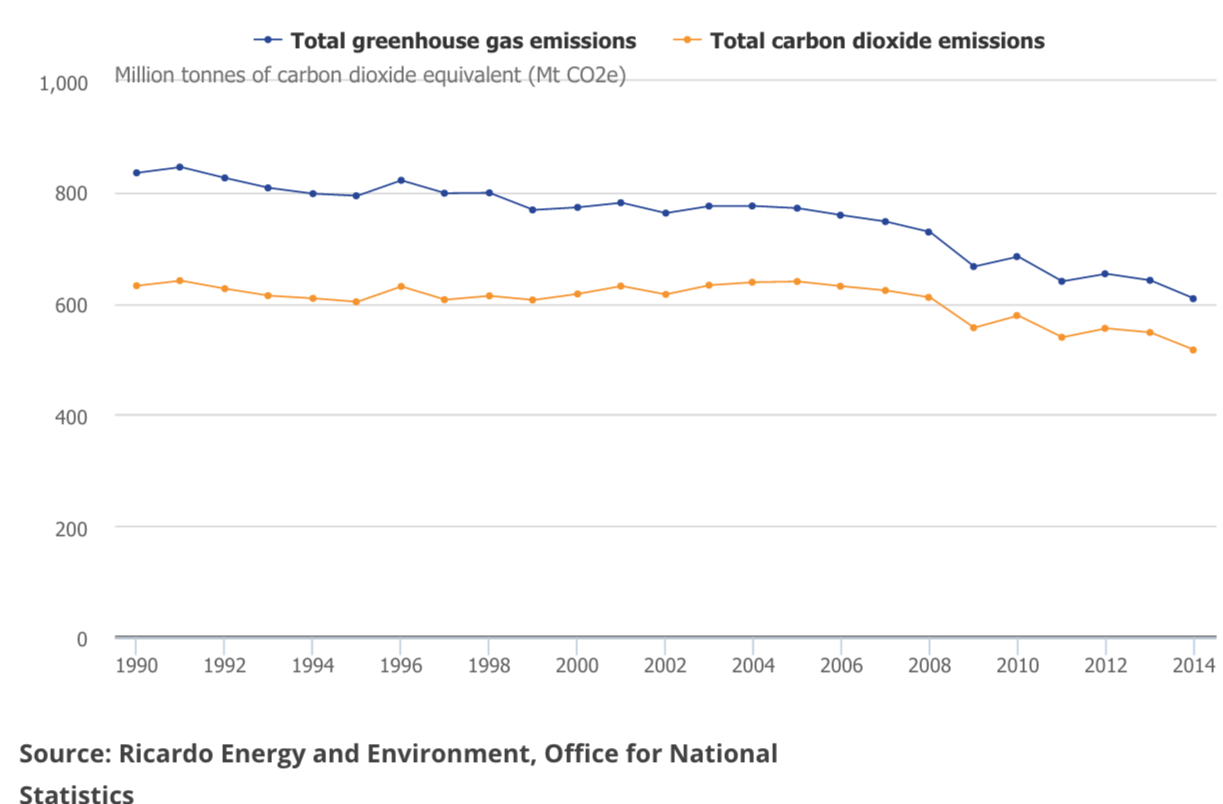
This chart, from ONS’s Environmental Account 2016 shows that emissions of greenhouse gases in 2014 were estimated to be 609 million tonnes of carbon dioxide equivalent, the lowest level since 1990. Greenhouse gas emissions peaked in 1991 at 845 million tonnes of carbon dioxide equivalent. Since then, greenhouse gas emissions have decreased by 28%.
Carbon dioxide represented around 85% of total greenhouse gas emissions in the UK in 2014, an increase from 76% in 1990.
The chart also shows there have been occasional increases in greenhouse gas emissions. For example, a rise between 2009 and 2010 was driven by the recovery of economic activity after the 2008 downturn.
Emissions increased between 2011 and 2012, because of a drop in average air temperature. This caused an increase in fuel consumption, and an increase in the proportion of electricity generated from coal.
Greenhouse gas emissions, UK, 1990 to 2014

Download the data
Gender pay gap
The gender pay gap is a topic that continually re-emerges as a topic for debate, particularly in news headlines.
This chart, which is based on median gross hourly earnings (excluding overtime), shows how the gender pay gap widens significantly from the age of 40.
How much more men earn than women, as a percentage of men’s earnings, by age group
Based on median gross hourly earnings (excluding overtime), UK, April 2015
Download the data
Human capital
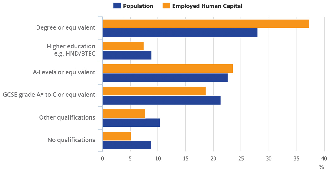
This chart is from our latest publication of Human Capital Estimates, 2015. Human capital is a measure of the knowledge, skills, and attributes that individuals hold. These factors enable individuals to work, and therefore produce something of economic value.
Employed human capital by highest qualification, 2015

Source:Human capital estimates, 2015
Download the data
The chart shows the effect of qualifications on the distribution of human capital.
In 2015, 28% of the working age population held a degree or equivalent but they accounted for 37.3% of the UK human capital. This is because on average, they have higher human capital.
In contrast, the 8.8% of the working-age population who have no formal qualifications accounted for 5.1% of the UK’s human capital stock.
UK exports to the EU
This chart was suggested by ONS’s Central Statistics Team.
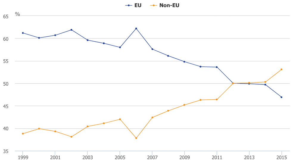
Exports of goods from the UK to EU and non-EU countries as a percentage of all UK exported goods

Source: UK Balance of Payments: The Pink Book 2016
The chart shows that UK goods exports to non-EU countries have grown at a faster rate than UK goods exports to the EU.
Trade was one of the big topics of debate around the EU referendum and it will continue to be analysed as the process towards leaving the EU begins.
In 2015 UK goods exports to non-EU countries were valued at £151 billion, compared with exports to the EU, which was £134 billion.
The drop in demand coincides with a dip in the economic fortunes in the euro area in 2012 and highlights weaker demand growth in the EU markets and much stronger demand growth in the non-EU markets.
Weaker demand growth could be limited by economic conditions in the eurozone.
For more information, please contact: bop@ons.gsi.gov.uk